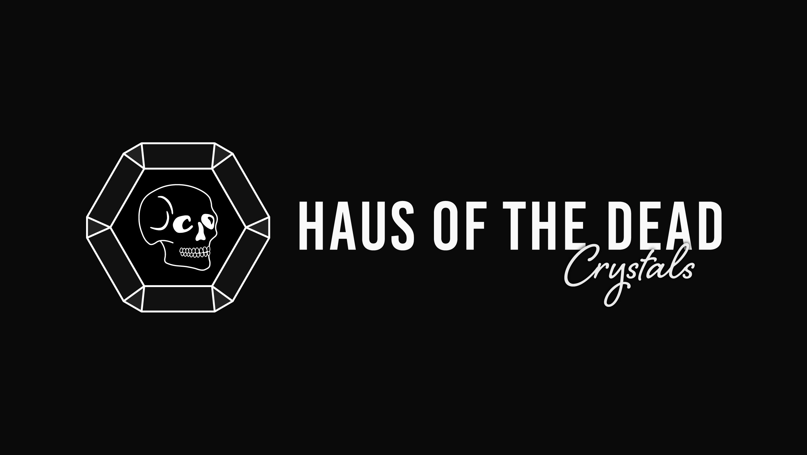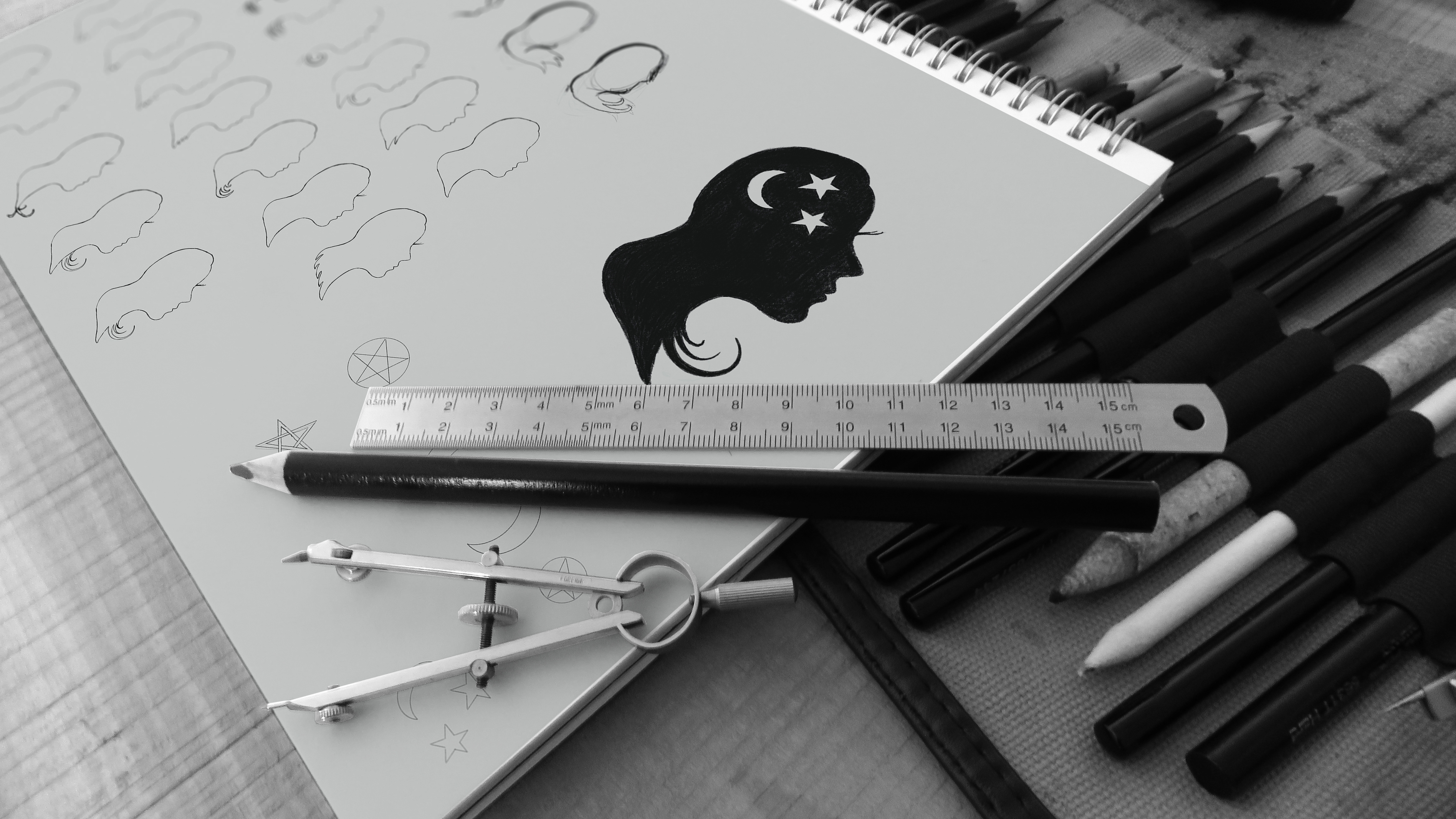
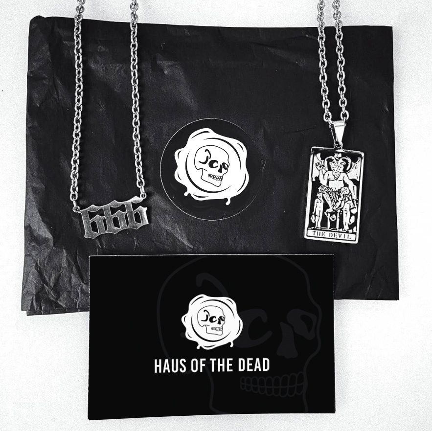
client project for an online business which sells hand made jewellery with a gothic theme. the logo needed to represent the gothic aesthetic as well as the hand made feel of a small business.
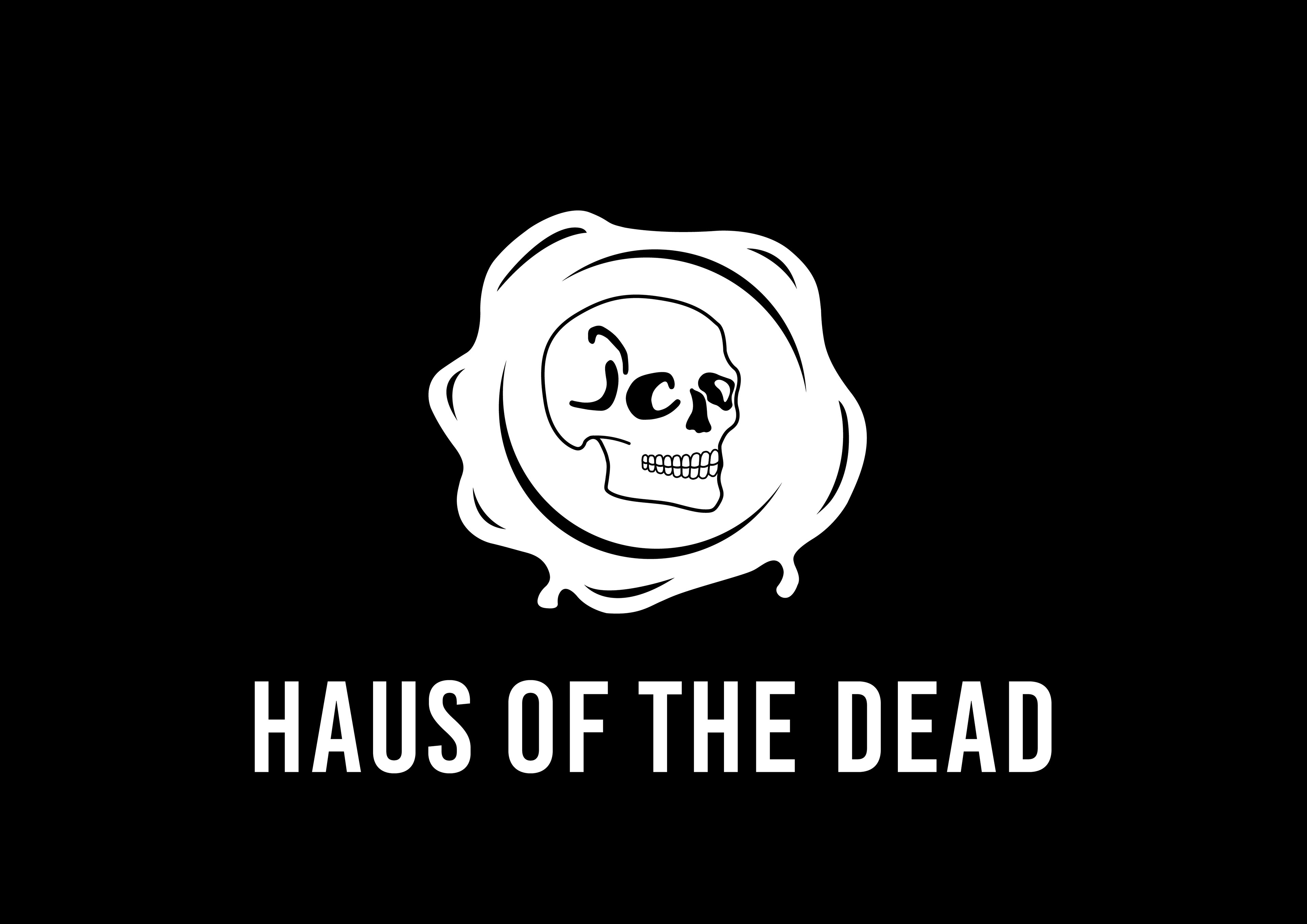
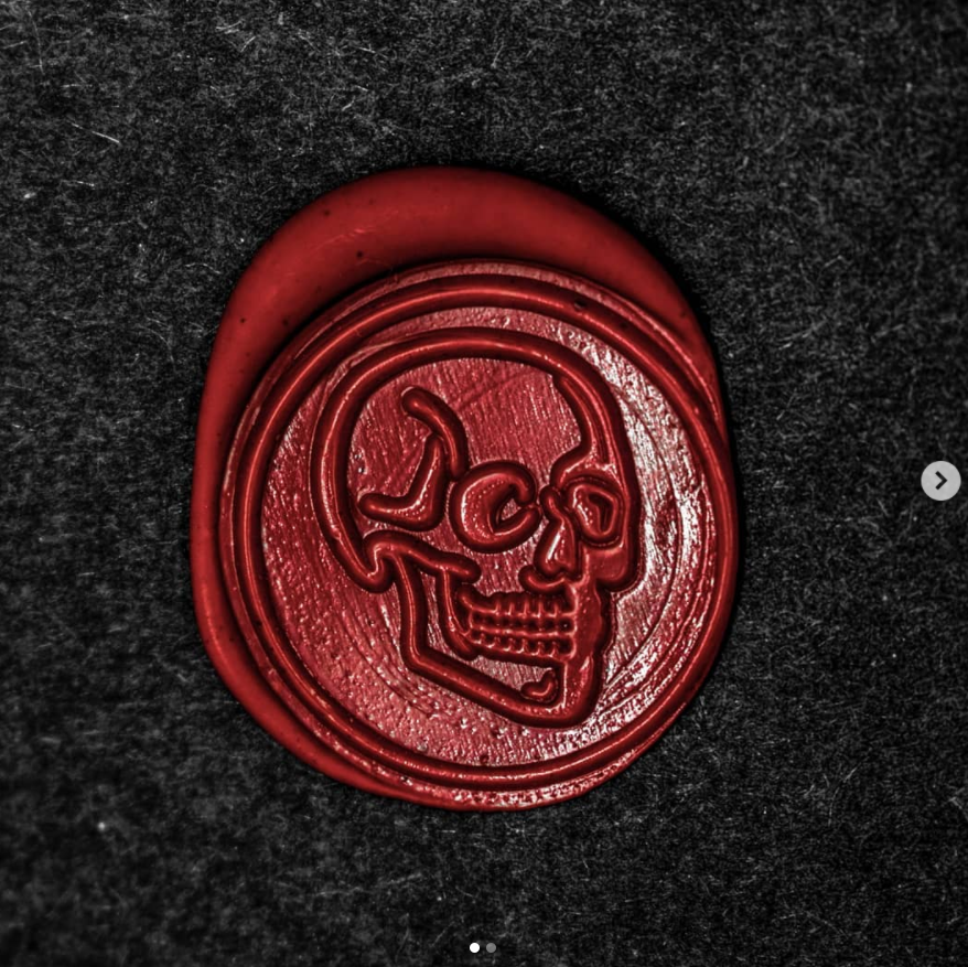
logo inspiration came from the wax seal originally used on the packaging containing the jewellery and represents how the business started with its hand crafted jewellery.
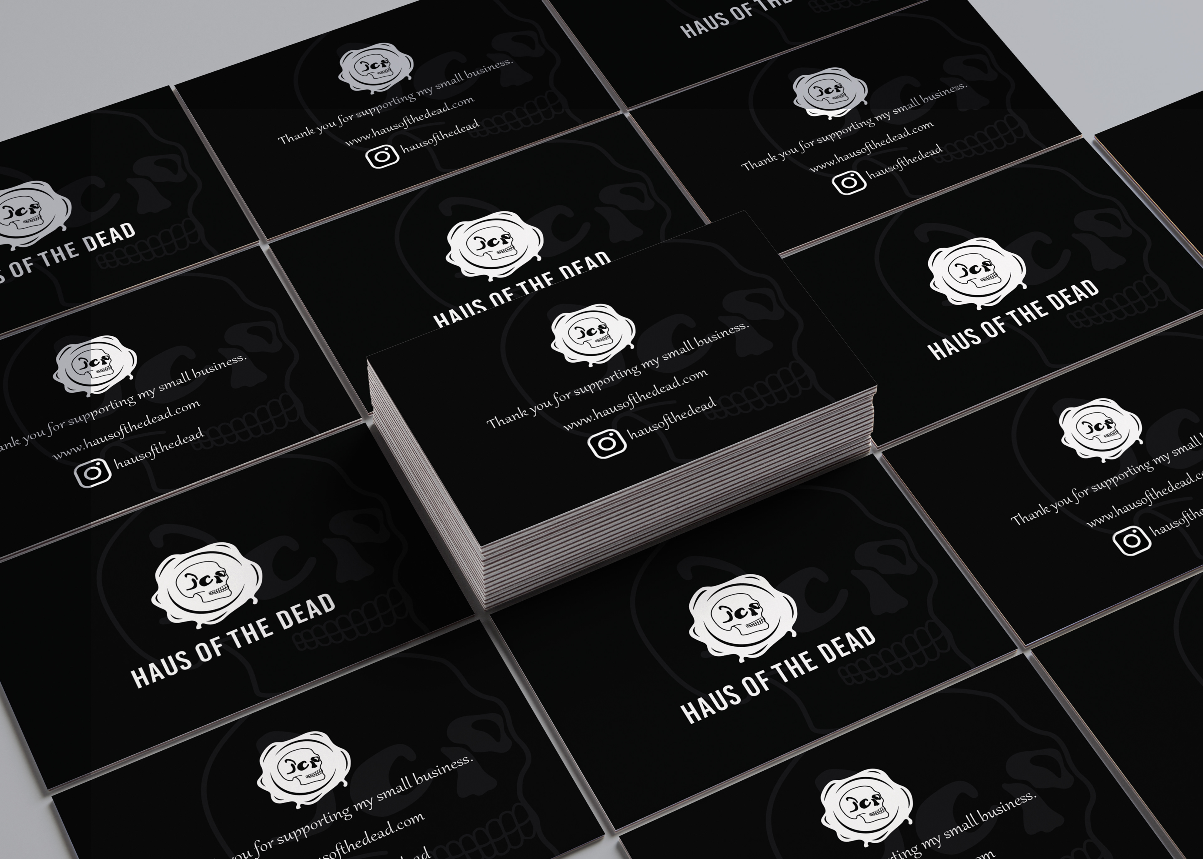
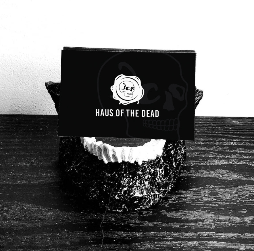
business card layout.
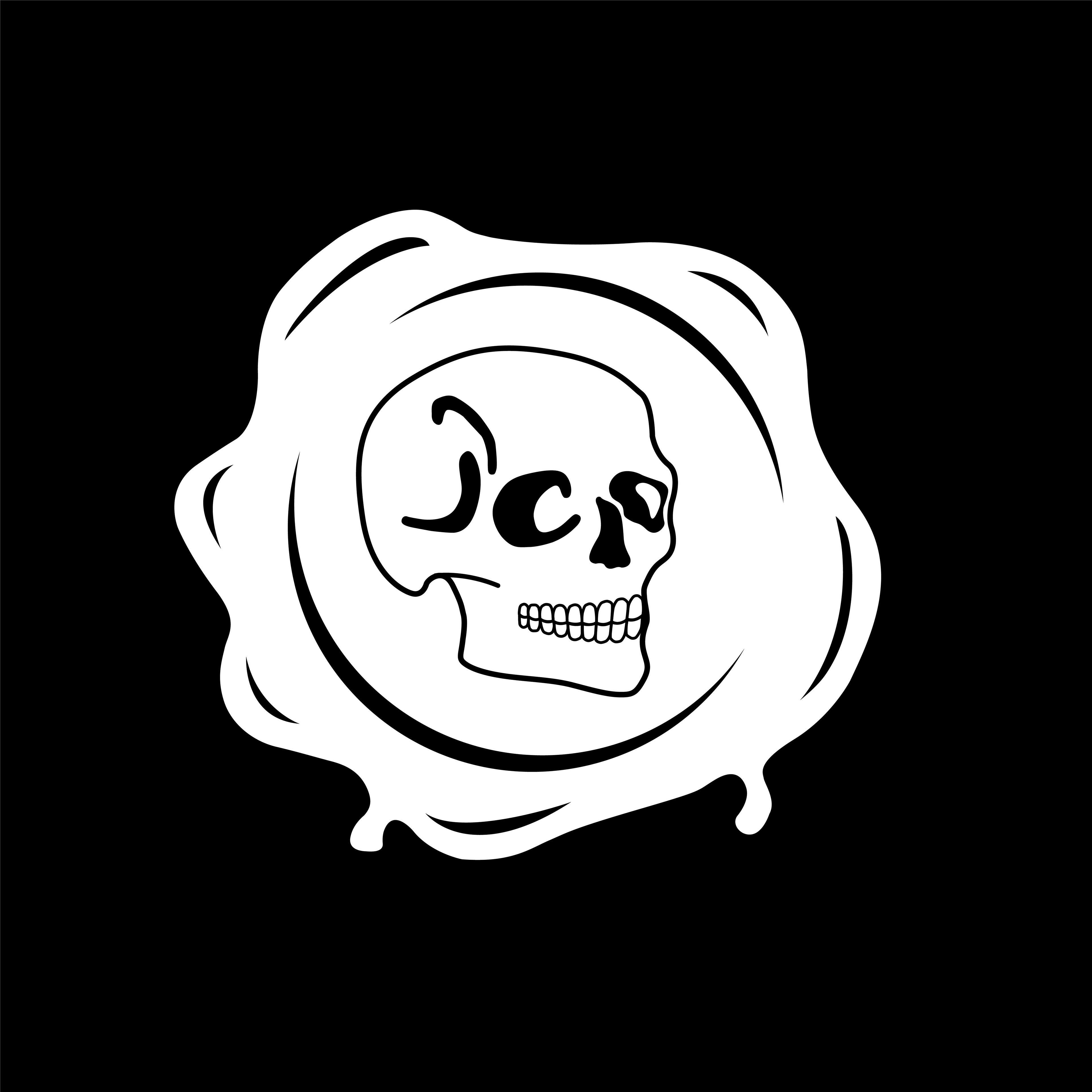
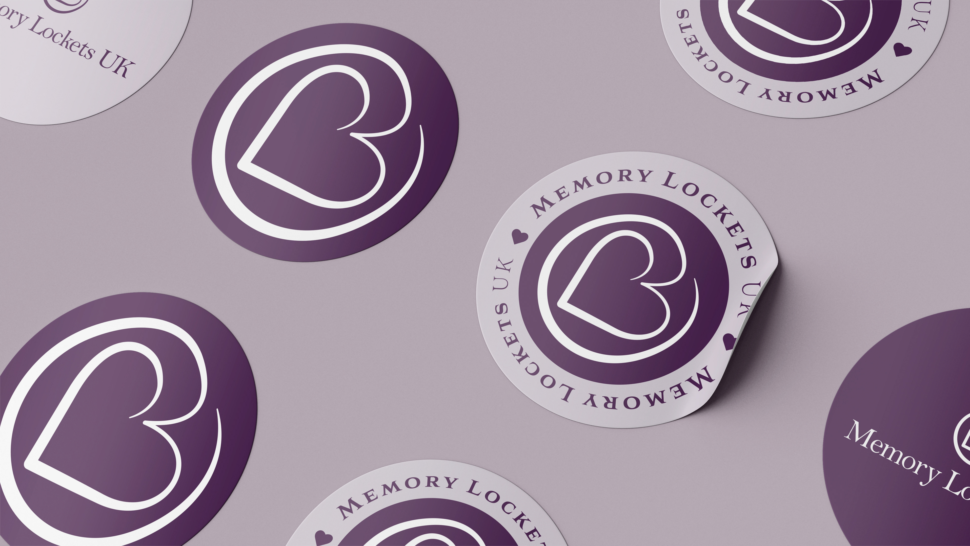
alternate logo layouts which both have high contrast and bold lines suitable for different web based media and print media of varying coloured backgrounds.
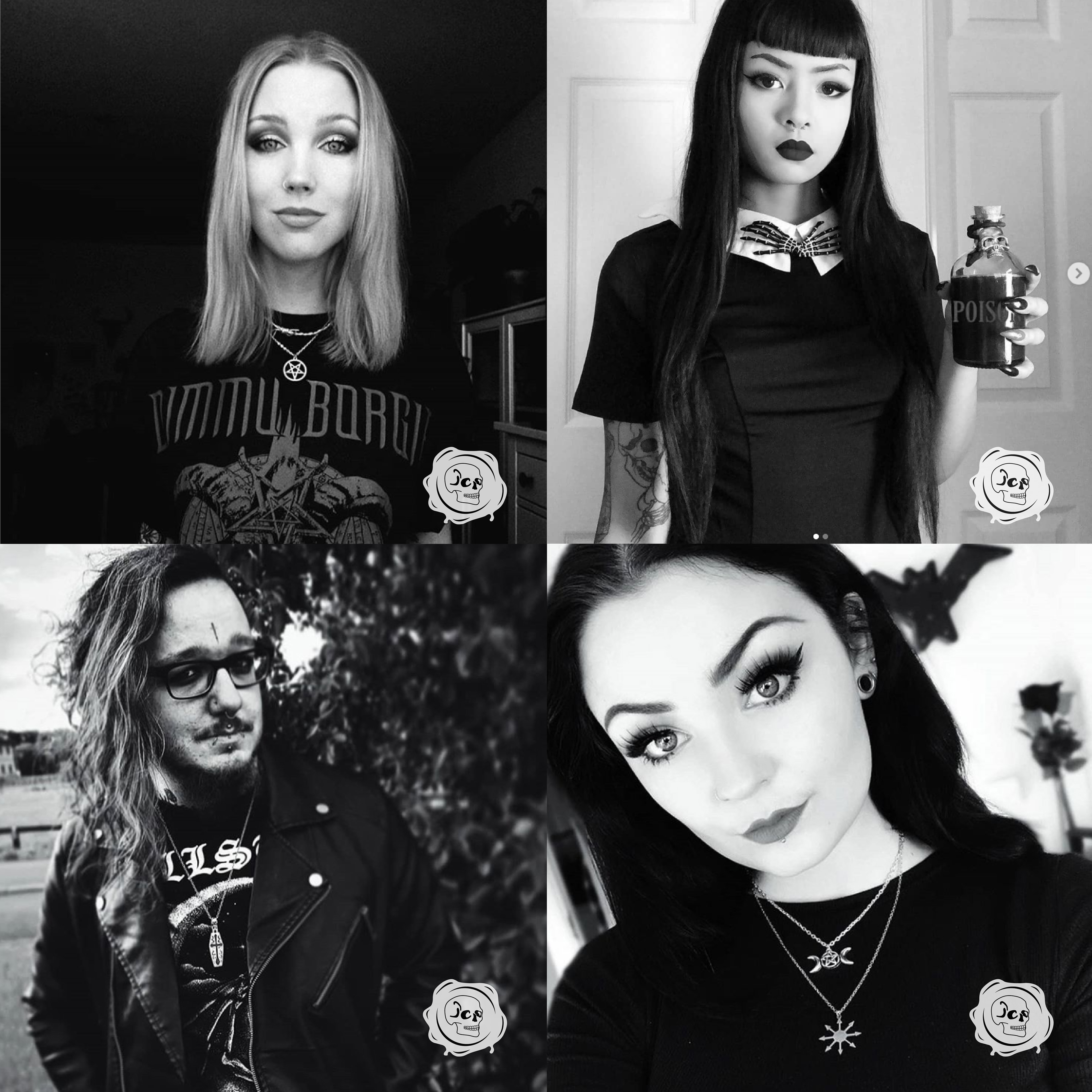
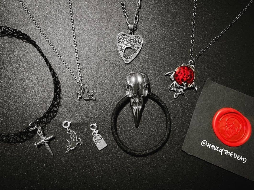
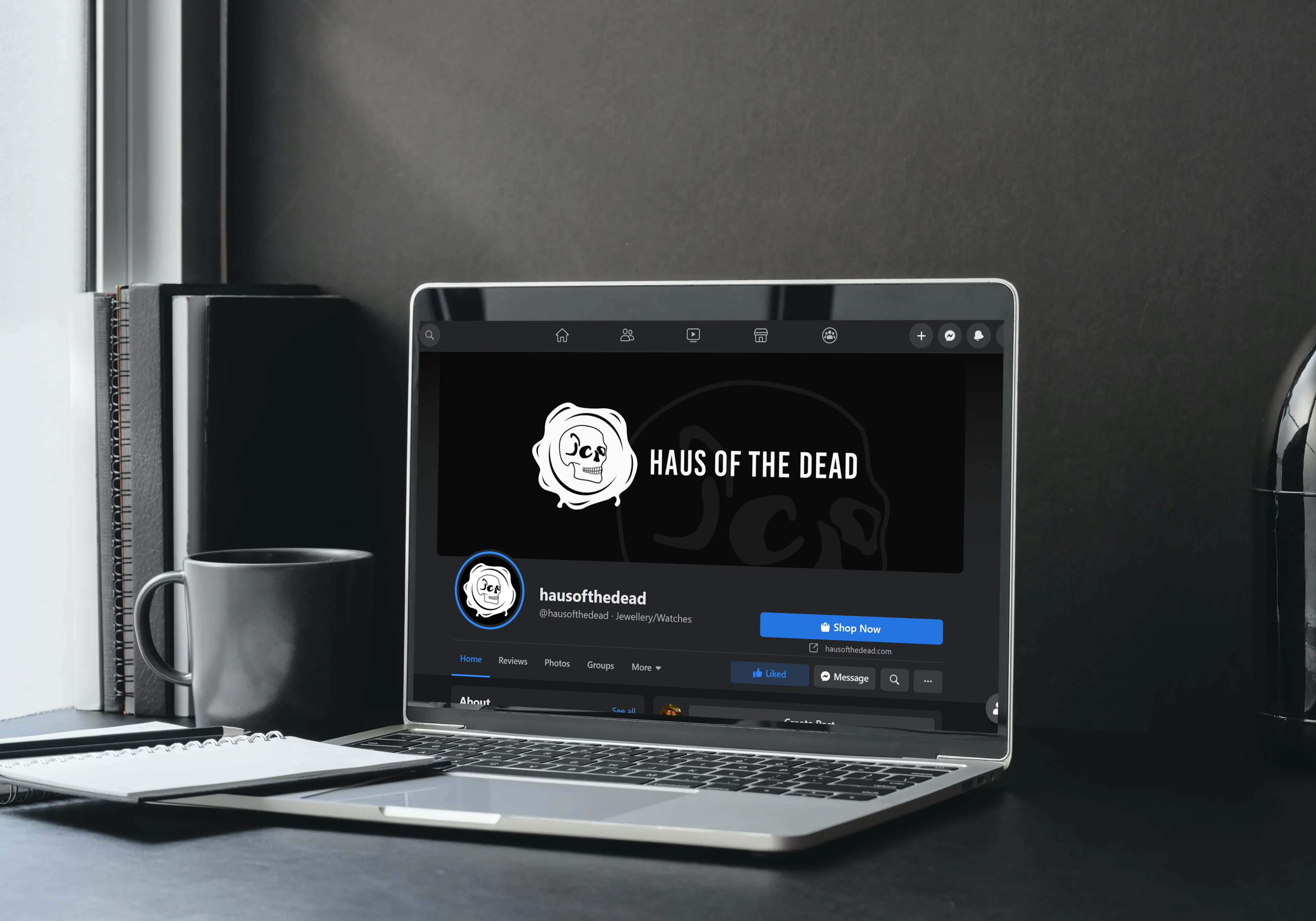
examples of social media posts using the logo to clearly represent haus of the dead but also keeping within the aesthetic of the gothic brand.

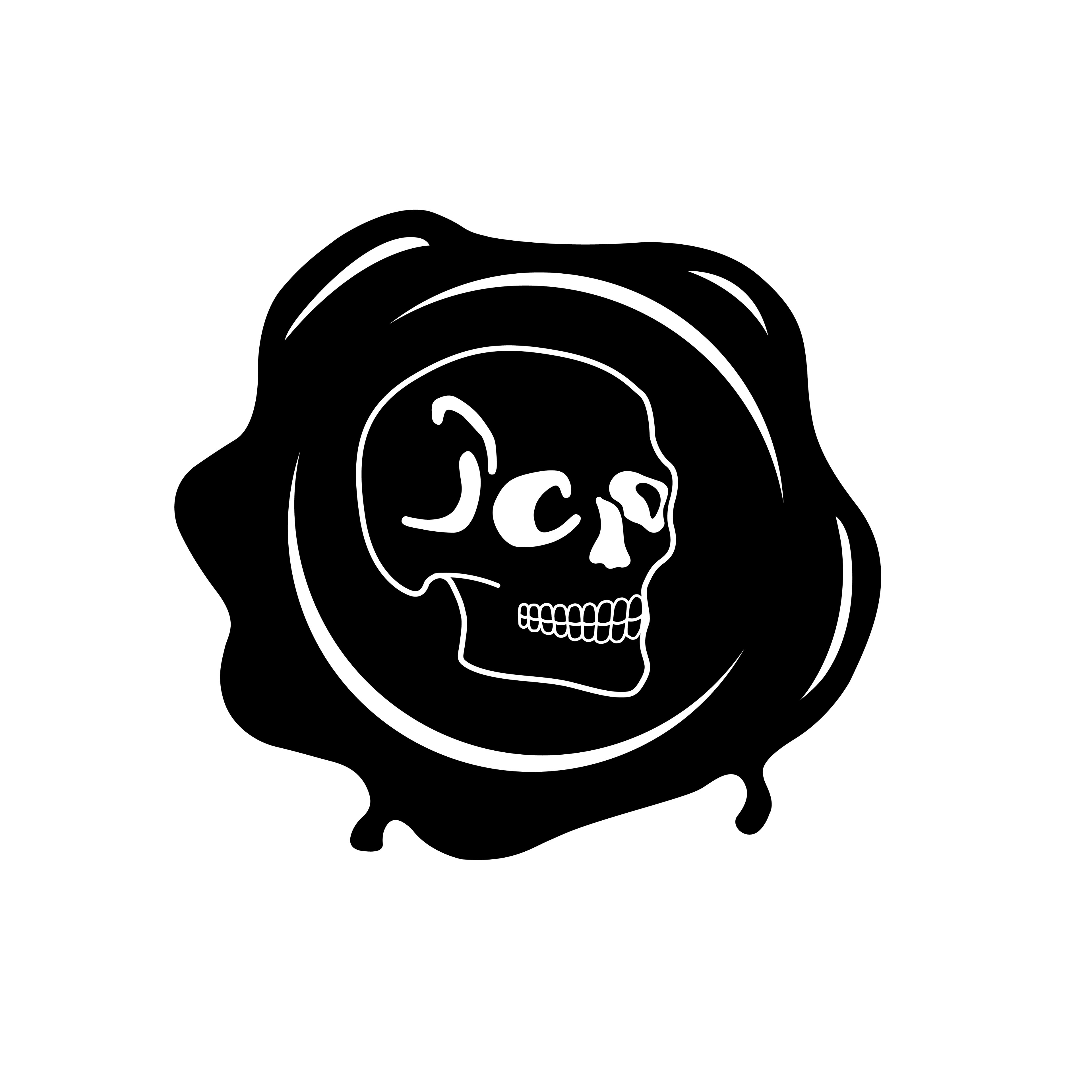
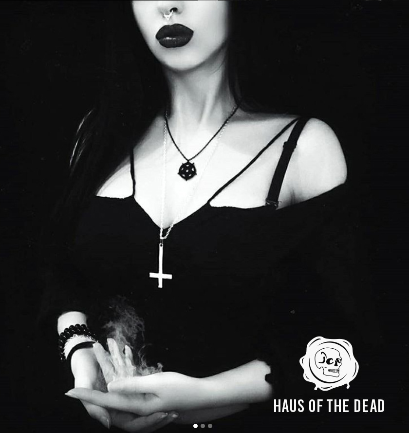
alternate logo colouring with a more subtle black and white.